COVID-19 Data Analysis and Visualization for Nigeria and Africa


Introduction
The COVID-19 pandemic has affected millions of people worldwide, and Africa is no exception. As the pandemic continues, there is a growing need for accurate and up-to-date information about the spread of the virus. In this project, we analyze and visualize COVID-19 data for Nigeria and other African countries, which was scraped from the website https://ourworldindata.org/. This research was inspired by Alex Freberg
Data Sources
The data used in this case study was sourced from https://ourworldindata.org/ between 1st-Jan-2020 and 30th-Apr-2021. The website provides daily updates on COVID-19 cases, deaths, and recoveries from around the world.
Methodology
We carried out exploratory data analysis using SQL to clean, analyze, and visualize the COVID-19 data. We used PowerBI to extract data for Nigeria and other African countries from a SQL database. The data cleaning process involved removing missing values, correcting inconsistencies, and aggregating the data by country and date.
We ran SQL queries to perform exploratory data analysis to understand the patterns and trends in the data.
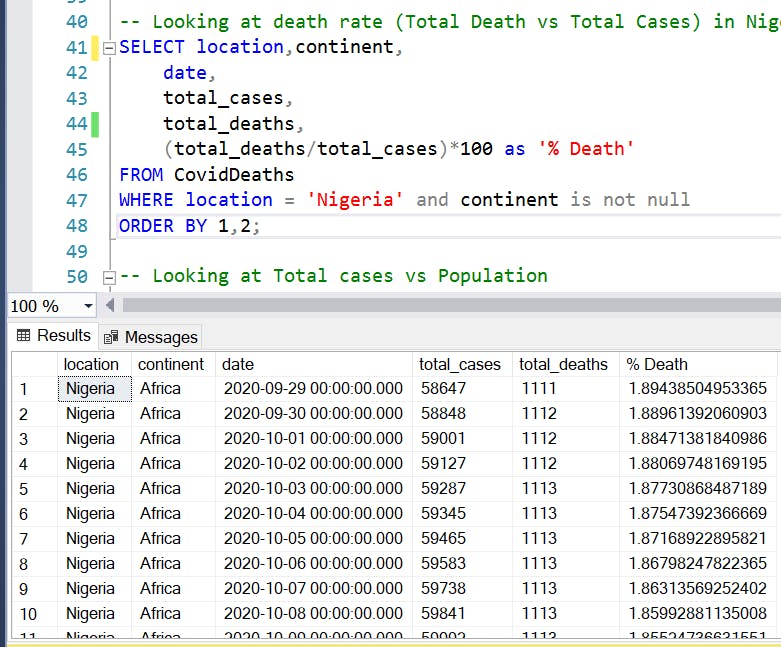
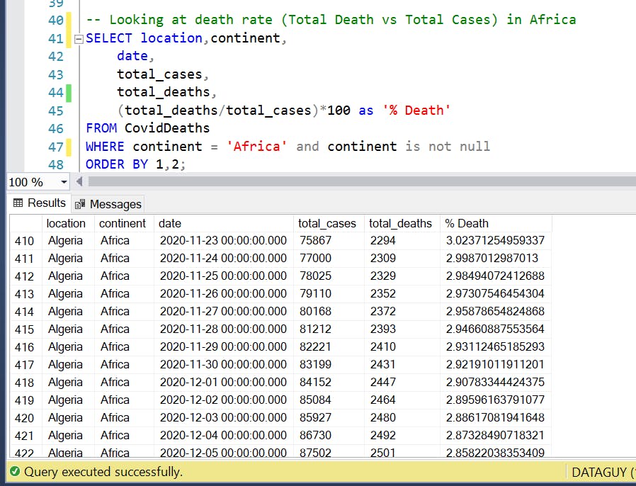
Looking at the mortality rate across Africa
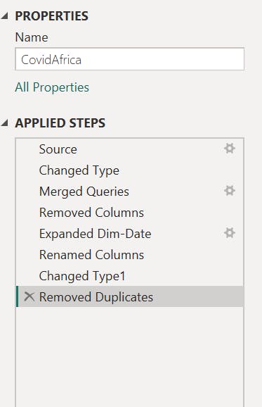
The data was transformed in Power query to remove duplicates, find the applied steps in the image below
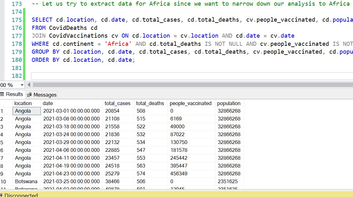
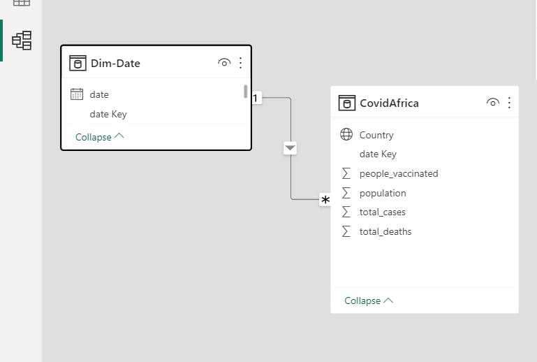
After cleaning the data, we created a model and established many relationships between the facts table and the dimensions table.
We performed exploratory data analysis to understand the patterns and trends in the data. We created visualizations such as line charts, bar charts, and maps to summarize the data and identify insights.
Results
Here are some of the insights derived from our analysis;
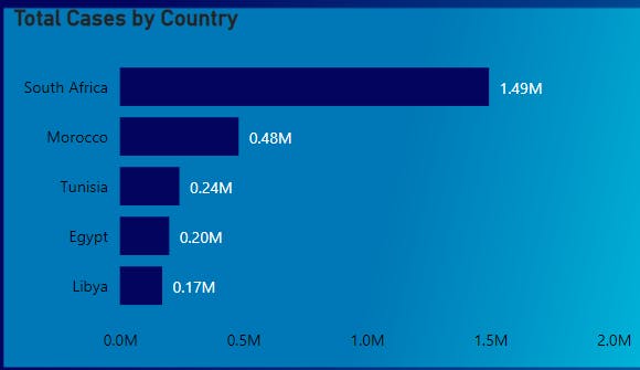
South Africa has one of the highest numbers of confirmed cases and deaths in Africa, with Morocco and Tunisia also being heavily affected.

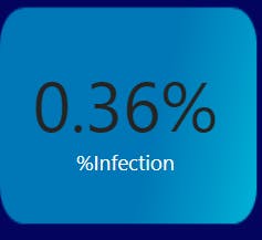
The infection rate in Africa is 0.36%, which is relatively low.
Countries with the highest number of reported cases ( South Africa, Morocco, Tunisia, Egypt, Libya, Nigeria)
Countries with the highest number of deaths recorded ( South Africa, Morocco, Tunisia, Egypt, Libya, Nigeria)
Top 2 countries with the most vaccination ( Morocco and Egypt)
We also created several interactive visualizations using PowerBI visuals to allow users to explore the data further. These visualizations include:
A map showing the number of deaths by country in Africa
A line chart showing the trend in the number of confirmed cases over time for Nigeria in Africa
A bar chart showing the top 10 African countries with the highest number of confirmed cases
A dynamic slicer to filter total cases by country.
Conclusion
In conclusion, our analysis and visualization of the COVID-19 data for Nigeria and other African countries provided valuable insights into the impact of the pandemic in Africa. While the pandemic has affected Africa, the infection rate on the continent is relatively low compared to other regions of the world. We hope this project helps increase awareness of the pandemic and provides valuable information for researchers and the general public in Nigeria and Africa.
- Here is a link to my report on PowerBi Service
Find the complete code in my Github repository.
You can connect with me on Twitter and LinkedIn
Thank you for reading, and I hope you found this engaging.